In designing the poster for “Between the Trees,” my objective was to encapsulate the chilling essence and eerie atmosphere of the film. This project presented an exciting challenge: to create a visual narrative that not only attracts an audience but also evokes the haunting and suspenseful themes central to the movie.
Concept and Design
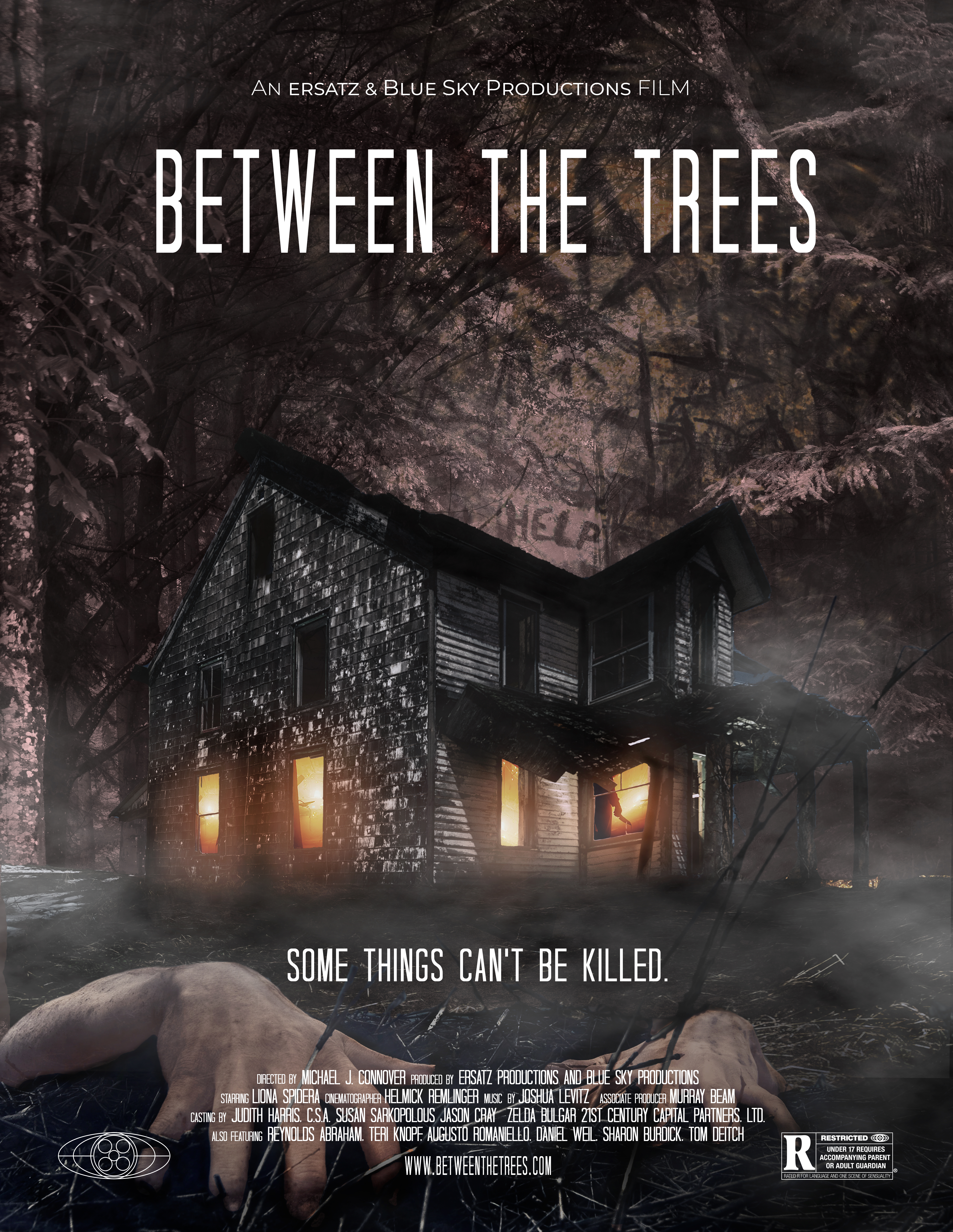
The design revolves around the central imagery of an ominous, dilapidated house set within a dark, foreboding forest. This imagery is crucial in setting the tone for the film, hinting at the terror that lies within and the mysteries that the story will unravel. The house, with its illuminated windows piercing through the darkness, serves as a focal point, drawing the viewer into the narrative and piquing their curiosity about what lies inside.
Color Palette and Imagery
The color palette is deliberately muted, featuring shades of black, brown, and grey, with occasional highlights of eerie yellow light. This choice enhances the sense of dread and suspense, creating a stark contrast that emphasizes the isolation of the house. The use of shadows and fog adds depth to the composition, further immersing the viewer in the unsettling atmosphere of the film.
Typography
The typography for the title “Between the Trees” is designed to be both bold and haunting. The elongated, narrow font gives a sense of unease and tension, perfectly aligning with the film’s genre. The tagline “Some Things Can’t Be Killed” is placed strategically to reinforce the horror elements and hint at the underlying themes of the storyline.
Additional Elements
Subtle details, such as the faint, ghostly figures and the gnarled trees in the background, are incorporated to add layers of intrigue and horror. These elements are intentionally subdued to ensure they contribute to the overall atmosphere without overwhelming the main imagery. The inclusion of the film’s rating and credits at the bottom provides necessary information while maintaining the visual integrity of the design.
Reflection
This project allowed me to explore the intersection of graphic design and storytelling. My goal was to create a poster that not only captures the viewer’s attention but also conveys the mood and themes of “Between the Trees.” Through careful consideration of color, imagery, and typography, I aimed to produce a design that is not only aesthetically compelling but also deeply evocative of the film’s haunting narrative.
Influence of Scotland and the Psychology of Fear
A significant influence on this project was my time spent in Scotland studying the Psychology of Fear. Immersing myself in the landscapes and folklore of Scotland, I gained a deeper understanding of how fear is perceived and experienced. This academic and personal journey enriched my perspective, allowing me to integrate psychological elements of suspense and terror into my design. The brooding Scottish landscapes, with their misty moors and ancient forests, inspired the atmospheric depth and haunting quality of the poster. Understanding the psychological triggers of fear enabled me to create a design that not only visually represents horror but also resonates on a deeper, emotional level with the audience.
In conclusion, the “Between the Trees” poster is a testament to the power of visual design in conveying complex emotions and narratives. It serves as an invitation to the audience, offering a glimpse into the dark and mysterious world of the film, and ultimately enhancing their anticipation and excitement.